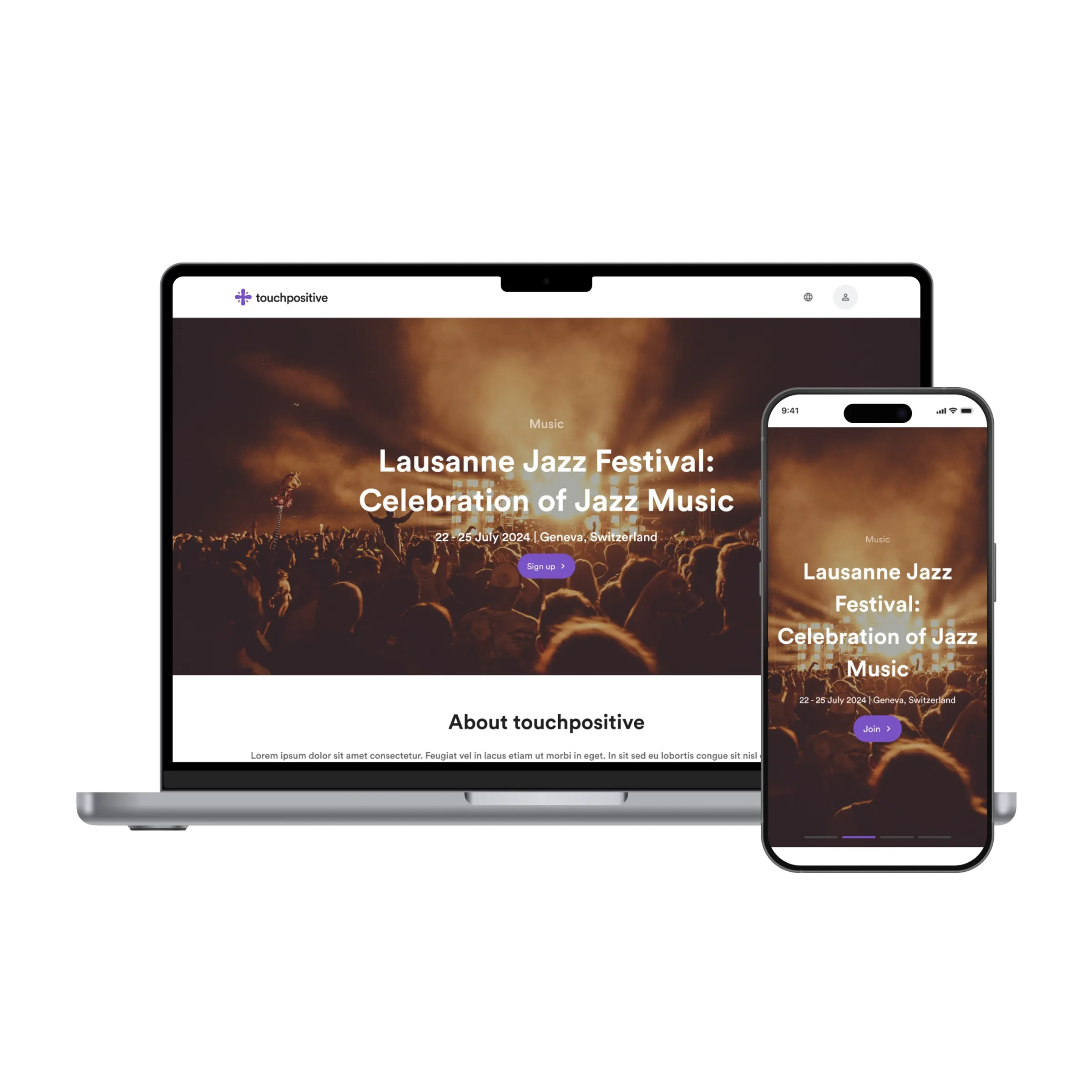
touchpositive is a platform for people who run events: a festival, a conference, a school fair. Each organiser gets a public page, a sign-up flow and a way to keep in touch with the people who came. nine75 designed the public side of the product in 2024, the page attendees land on from a poster or a message, and the sign-up that follows, using the Lausanne Jazz Festival as the worked example. Mobile first, because that is where the poster’s QR code sends you.
Problem
Event pages are mostly read once, on a phone, by someone who has already decided to go and wants to know when and where. The client’s early version treated the page as a brochure: a menu, a long About section, sponsors, a gallery, and the sign-up button somewhere near the bottom. Sign-up itself asked 9 questions, including a postal address, for a free concert. Organisers, meanwhile, are not designers; whatever template they were given had to look right with a good photo and a bad one, a 3-word title and a 12-word one.
Approach
The page answers four questions in order: what, when, where, how do I get in. The hero is one photograph, the category as a small label, the title, one line of date and place, and one button. On the laptop the button says Sign up; on the phone it says Join, because the word is shorter and the thumb is already there. Everything an organiser might want to add, the About block, a programme, a map, sponsors, sits below the fold as optional sections that collapse when empty.
Sign-up is 4 fields: name, email, how many tickets, and one organiser-defined question. Paid events add the payment step; free events do not show it at all. Confirmation is a screen you can add to your calendar from, with the event photo repeated so the memory attaches to the right thing.
We designed 3 breakpoints, 390px, 768px and 1280px, and tested the template against 6 fictional events, a jazz festival, a hackathon, a fun run, a school play, a wedding and a market, to make sure the same layout held up with different photos and titles. The type is a geometric sans that stays legible over a photo; the brand’s purple appears exactly once per screen, on the button.
Outcome
24 screens covering the public page, sign-up, payment, confirmation and the email templates that follow, at 3 sizes each. The sign-up went from 9 fields to 4. The organiser’s template needs a photo and 4 lines of text to look finished, which was the point.
What we would do next
The organiser’s side, the dashboard where the page is built and attendees are counted, deserves the same discipline. An attendee wallet, one place for every ticket you hold. And a printable A4 poster generated from the same 4 lines, since most events here still start with a poster on a wall.