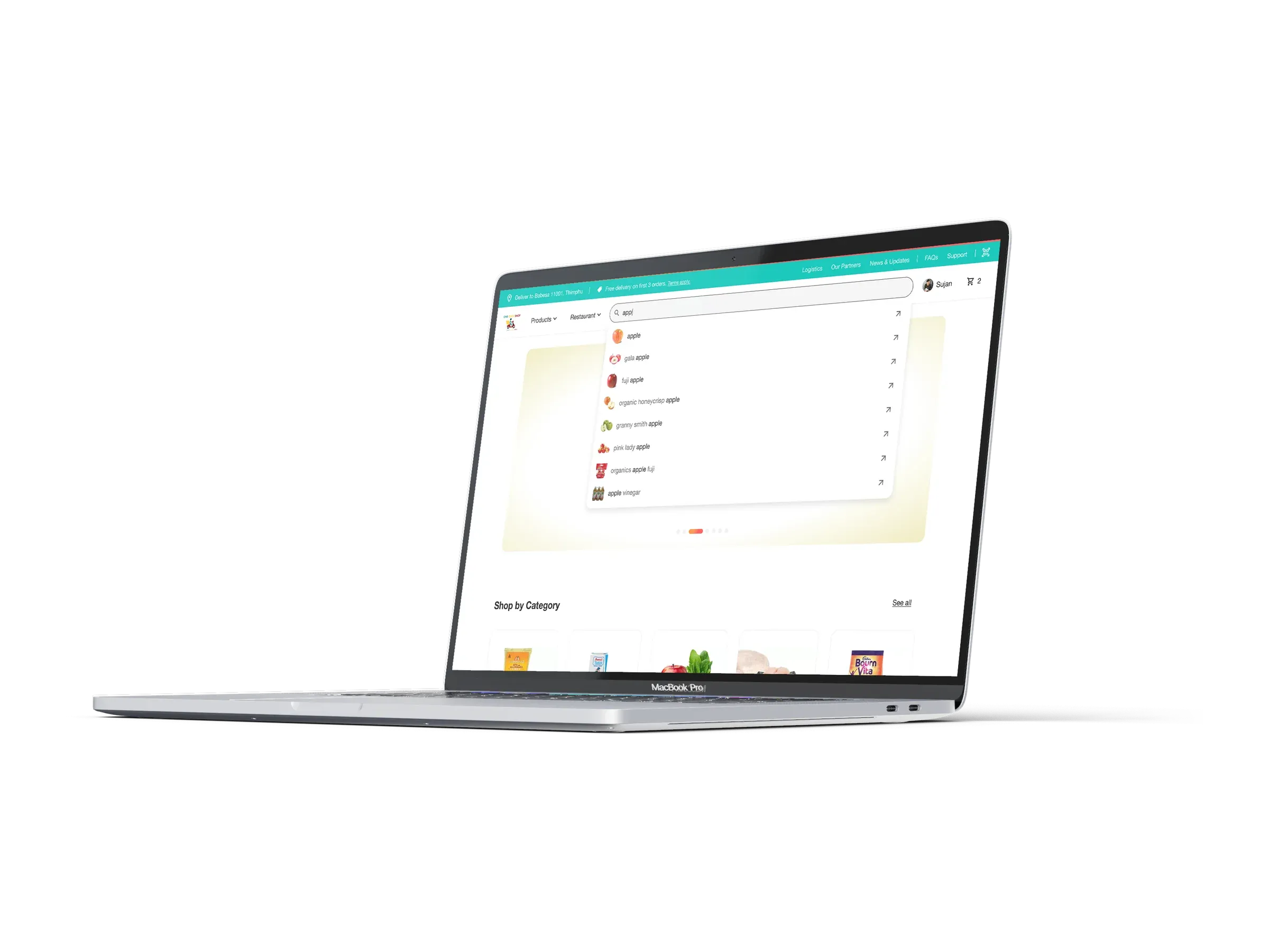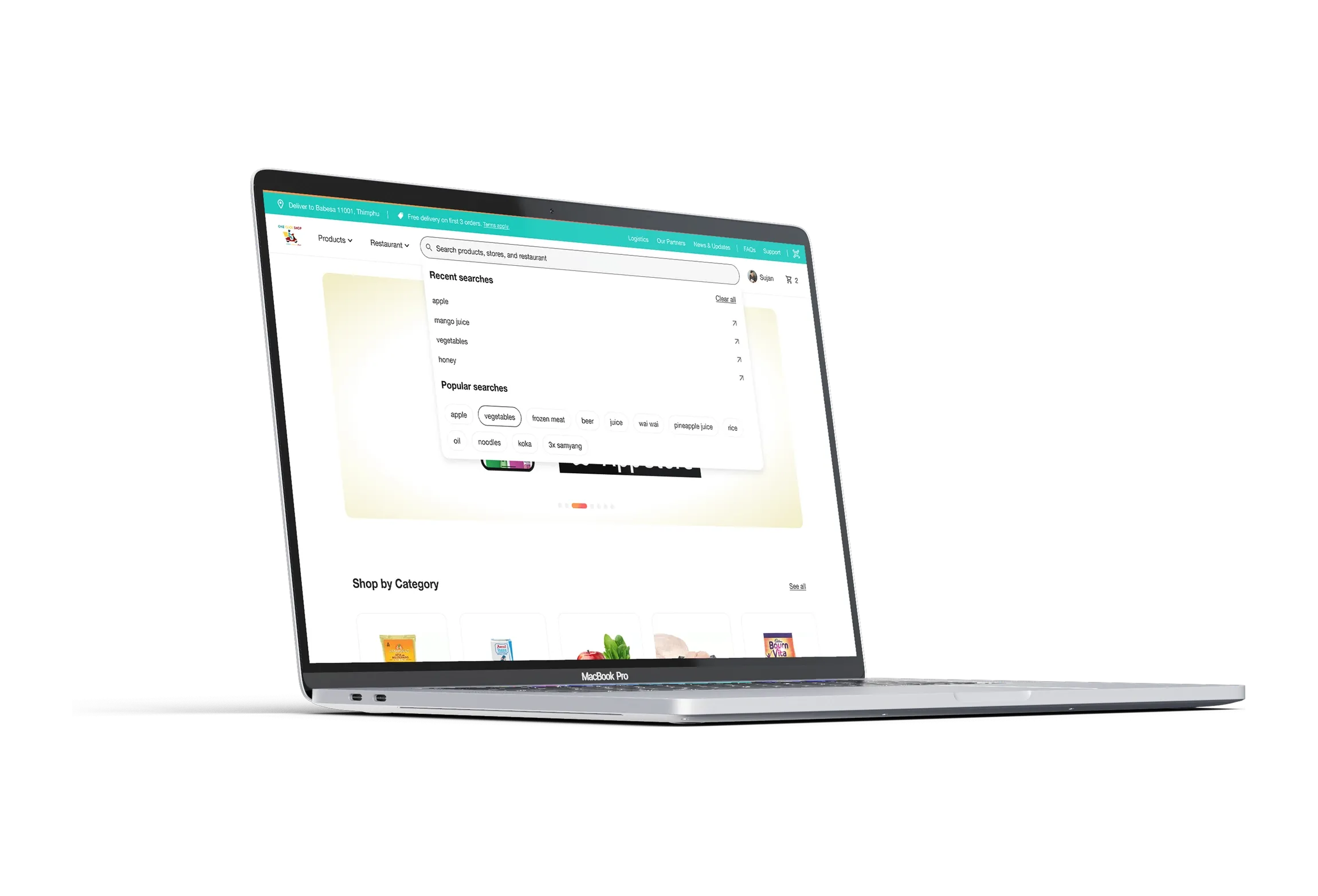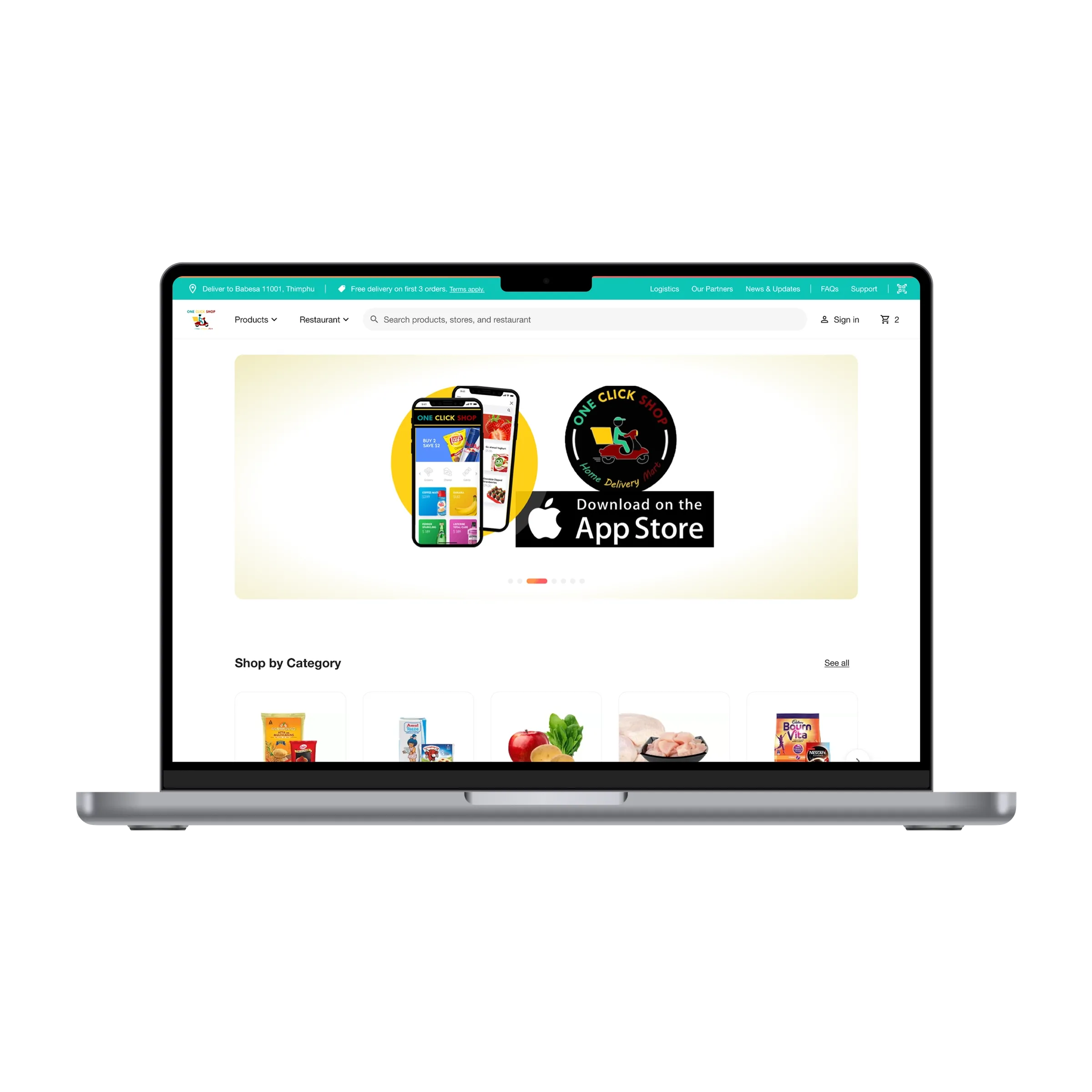
OneClickShop delivers groceries and household goods across Thimphu, from a web storefront and an iOS and Android app. The first version had grown feature by feature, and it showed: categories were hard to find, search returned the wrong things, and checkout asked too much. nine75 redrew the whole customer path, from the search bar to cash on delivery, and tidied the brand so the logo holds up on an app icon and a delivery box.
Problem
Most orders come from phones, often while someone is standing in their kitchen deciding what to cook. The old storefront made that harder than it should be. Categories lived behind a menu, so a shopper after dal scrolled past biscuits first. Search matched whole words only, so a typo found nothing. The product page buried weight, pack size and who was selling the item. Checkout ran to 7 steps, asked for the address every time, and treated cash on delivery, the way most of Thimphu pays, as the second option on a form few people finished. The client told us the address form was where people gave up.
Approach
We started with the shop’s own catalogue: 7 top-level categories and 4 partner stores. Shop by Category became the first thing on the home page, with real product photos instead of icons. Search got a typeahead that suggests from the third letter, remembers your last searches, and lists popular ones for the days you don’t know what you want.
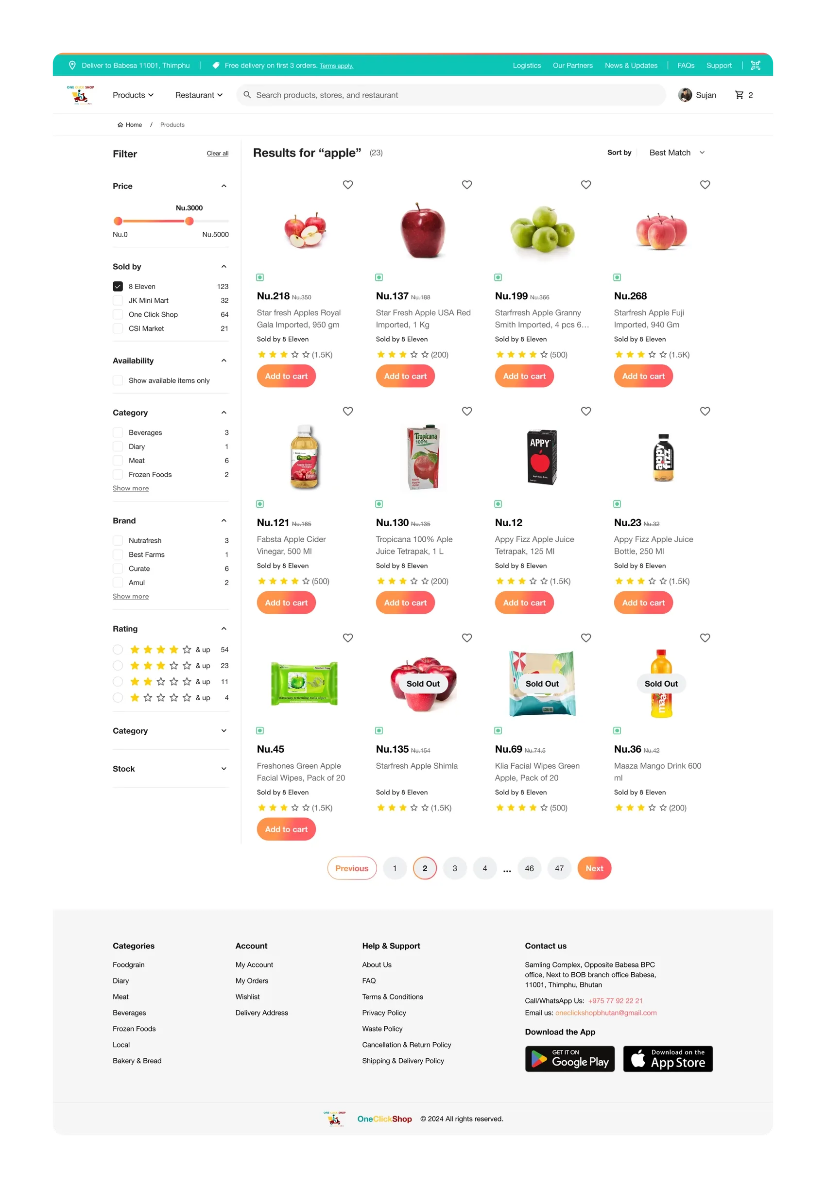
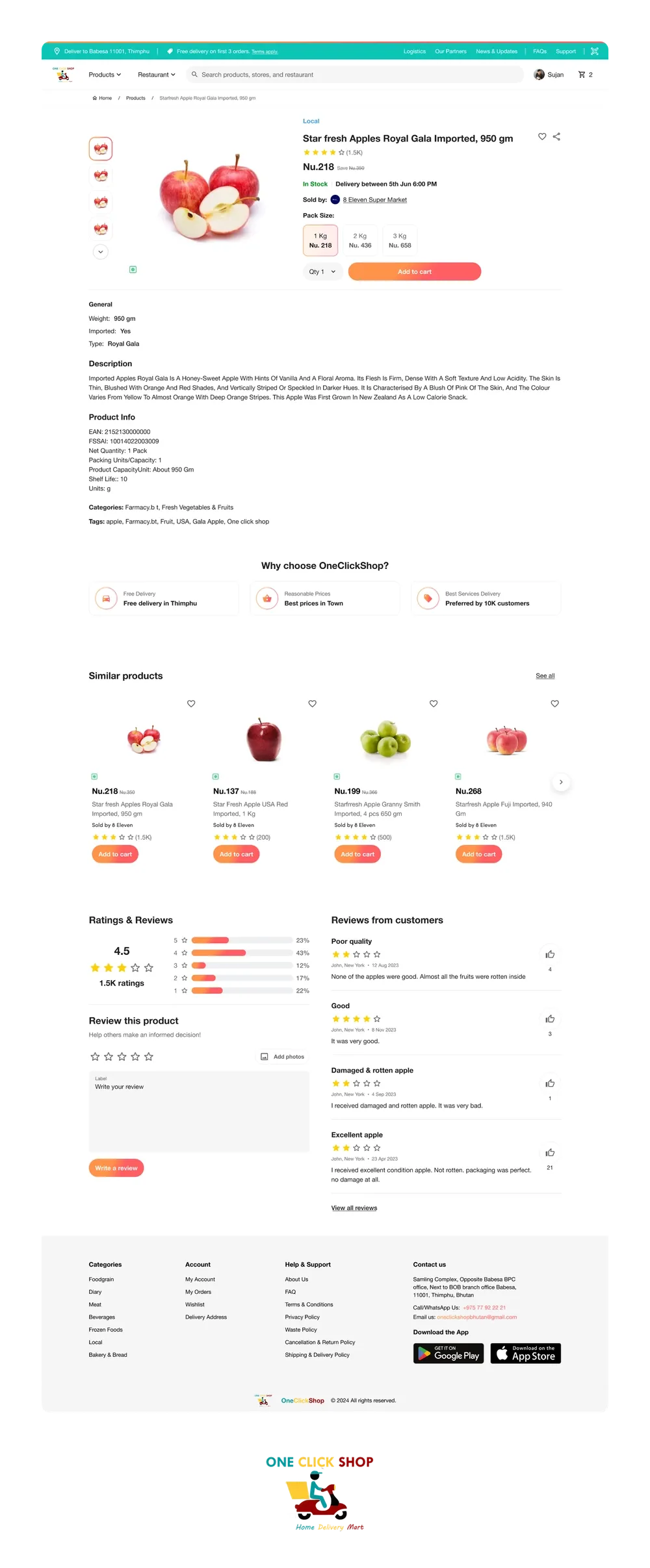
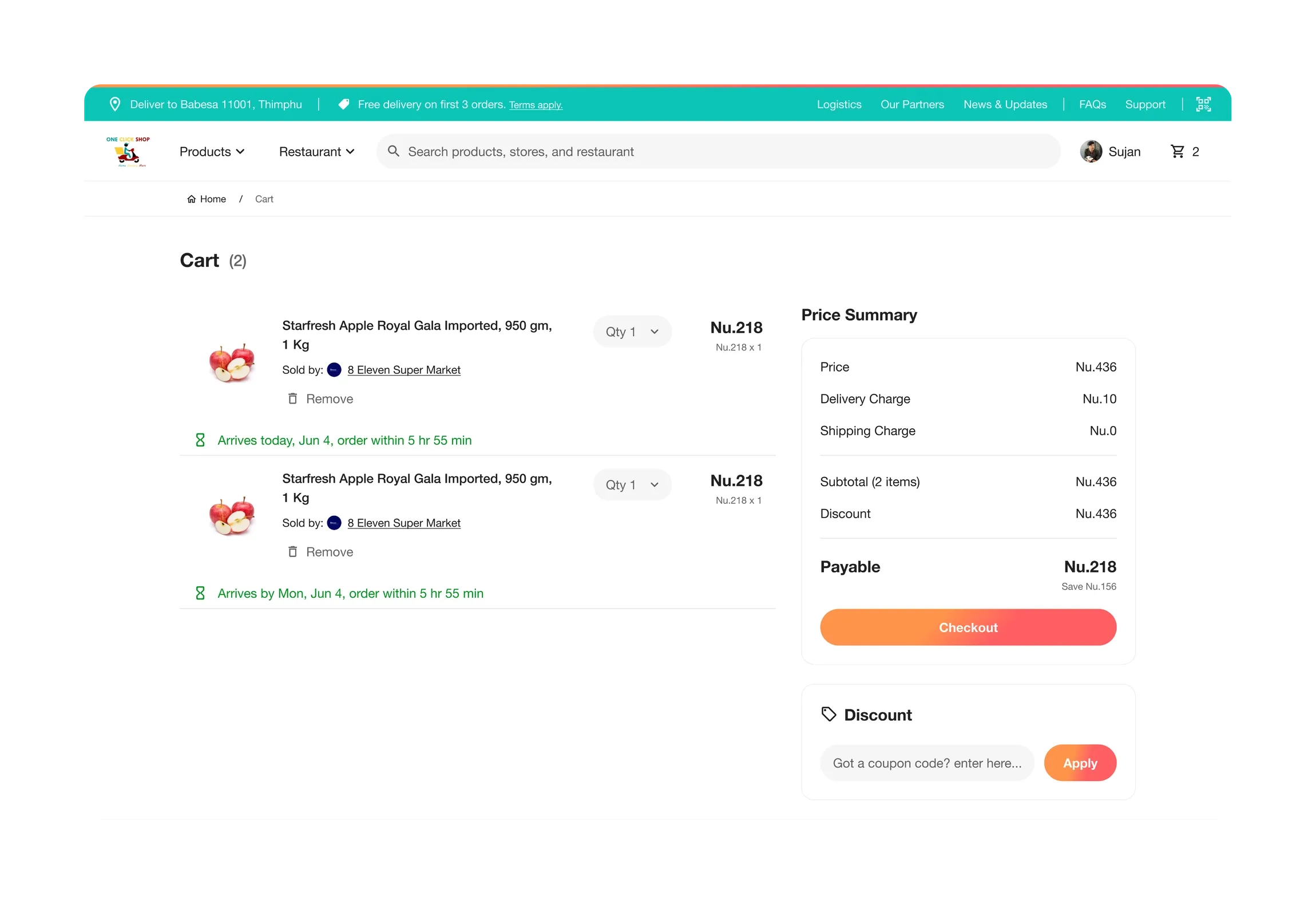
Results carry price, seller, rating and a one-tap Add to cart, with filters for price, seller, category, brand and stock. The product page puts price, pack size, seller and the delivery window above the fold and the long description below it.
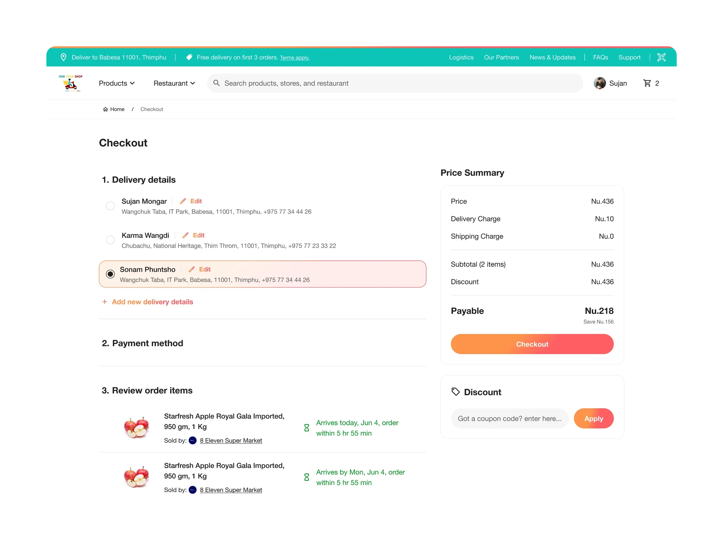
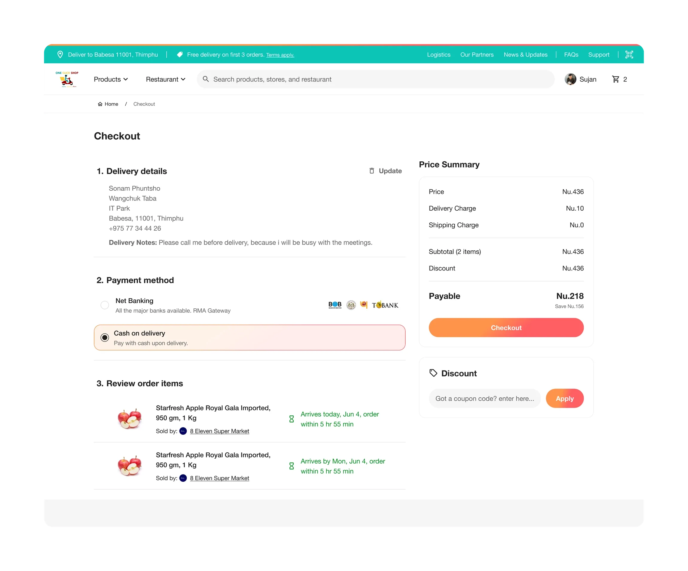
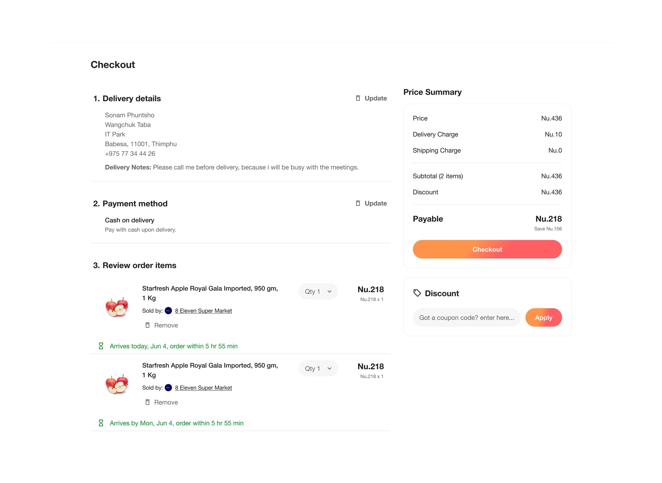
Checkout became 3 numbered sections on one page: delivery details, payment method, review. Saved addresses are a radio list. Cash on delivery sits next to net banking as an equal choice, with the bank logos people already know. The price summary stays put on the right, so the total never surprises anyone at the end.
We designed at 390px first and let the layout breathe on a laptop afterwards. The logo, a rider on a scooter under the wordmark, was cleaned up so it reads at app-icon size, and the palette settled on teal for the chrome and one warm orange for the button that matters on each screen.
Outcome
Checkout went from 7 steps to 4: cart, address, payment, confirm. Search answers partial words and remembers what you looked for last week. 48 screens were delivered for web, iOS and Android from one shared component set, with states for an empty cart, a sold-out item and a lost connection, so the client’s developers build each pattern once.
What we would do next
Order tracking with a live delivery window instead of “arrives today”. A reorder button on past orders, because grocery lists repeat. And a proper account page: sign-in is the one part of the old design we left alone, and it deserves the same attention.