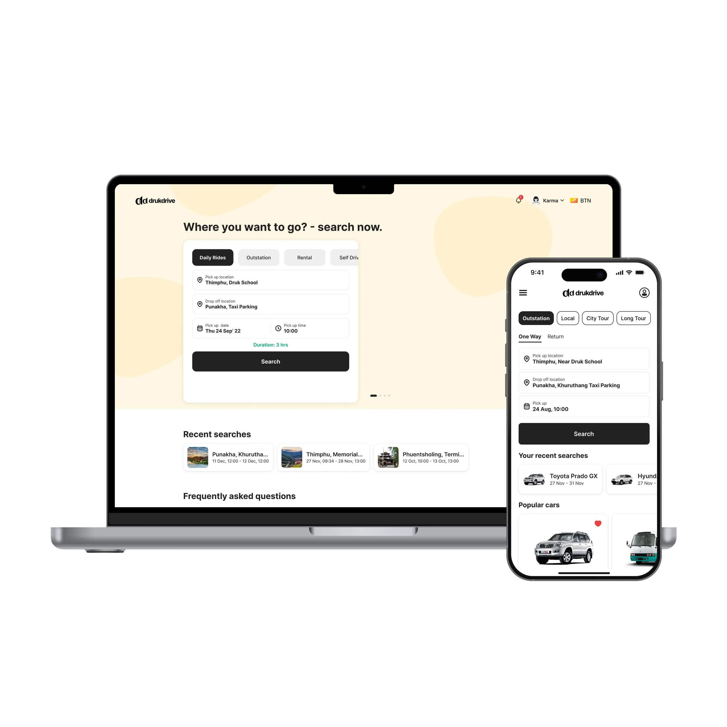
drukdrive books cabs and rents cars across Bhutan: a ride across Thimphu, a day trip to Punakha, a week in a Prado with or without a driver. The client had a working service and a website that made it hard to use. nine75 designed the web app and the iOS and Android app from the ground up, with one search form for all 4 ride types, a 4-screen booking path, local bank payment, and a mark that works at 20px in a tab bar.
Problem
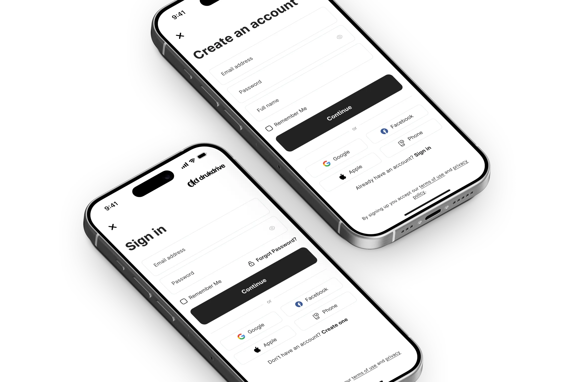
Cab booking in Bhutan mostly happens over the phone. A dispatcher quotes a price, you agree, you pay the driver. Any app has to be quicker than that call or people go back to it. The old site was not. Daily rides, outstation trips and rentals each had their own page and their own form. Prices appeared late, after personal details. Visitors from abroad could not tell whether the fare was in Nu. or dollars. Sign-in was required before you could even see a car. And the payment step sent people to a bank page that looked nothing like the site, which is where trust went.
Approach
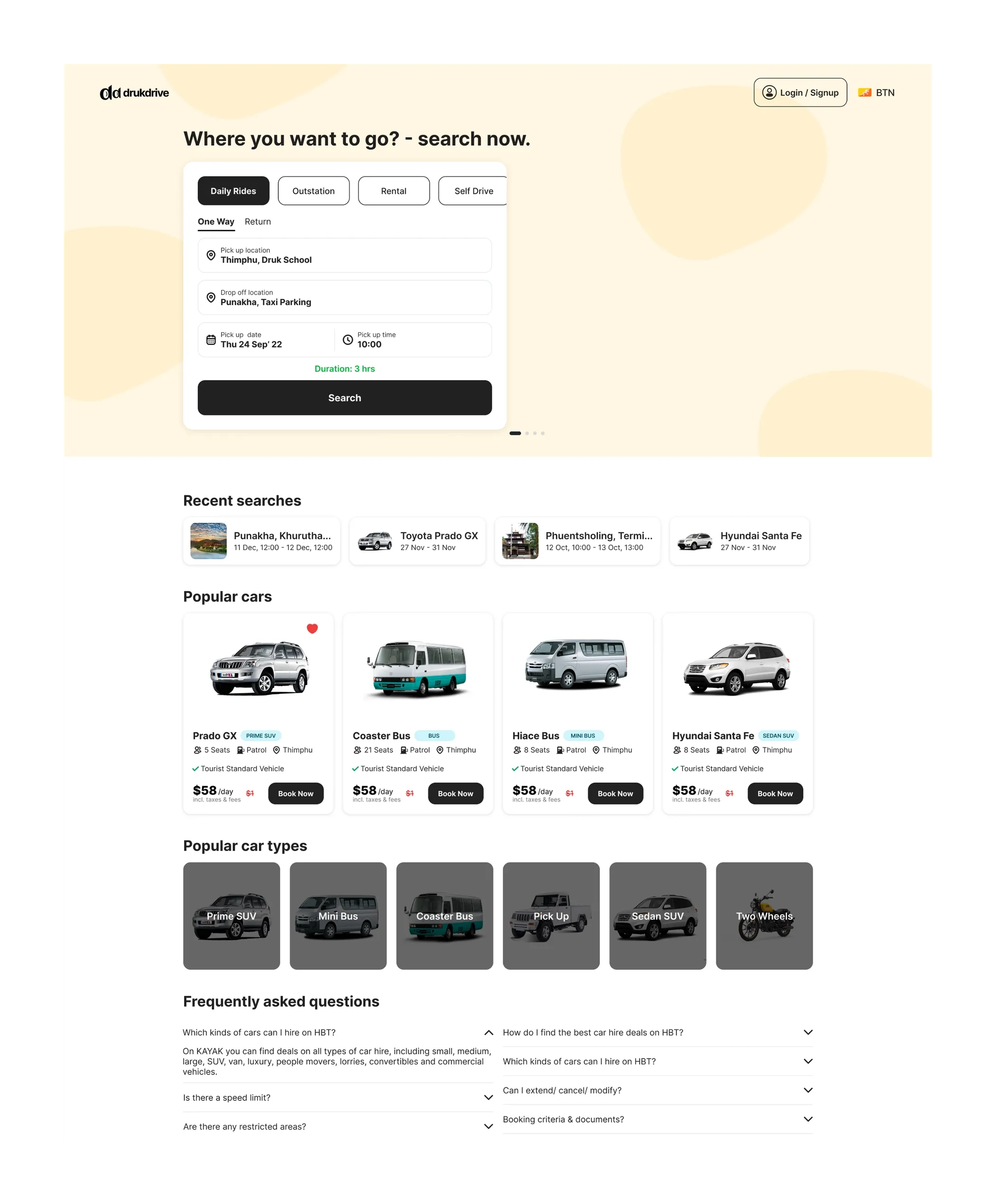
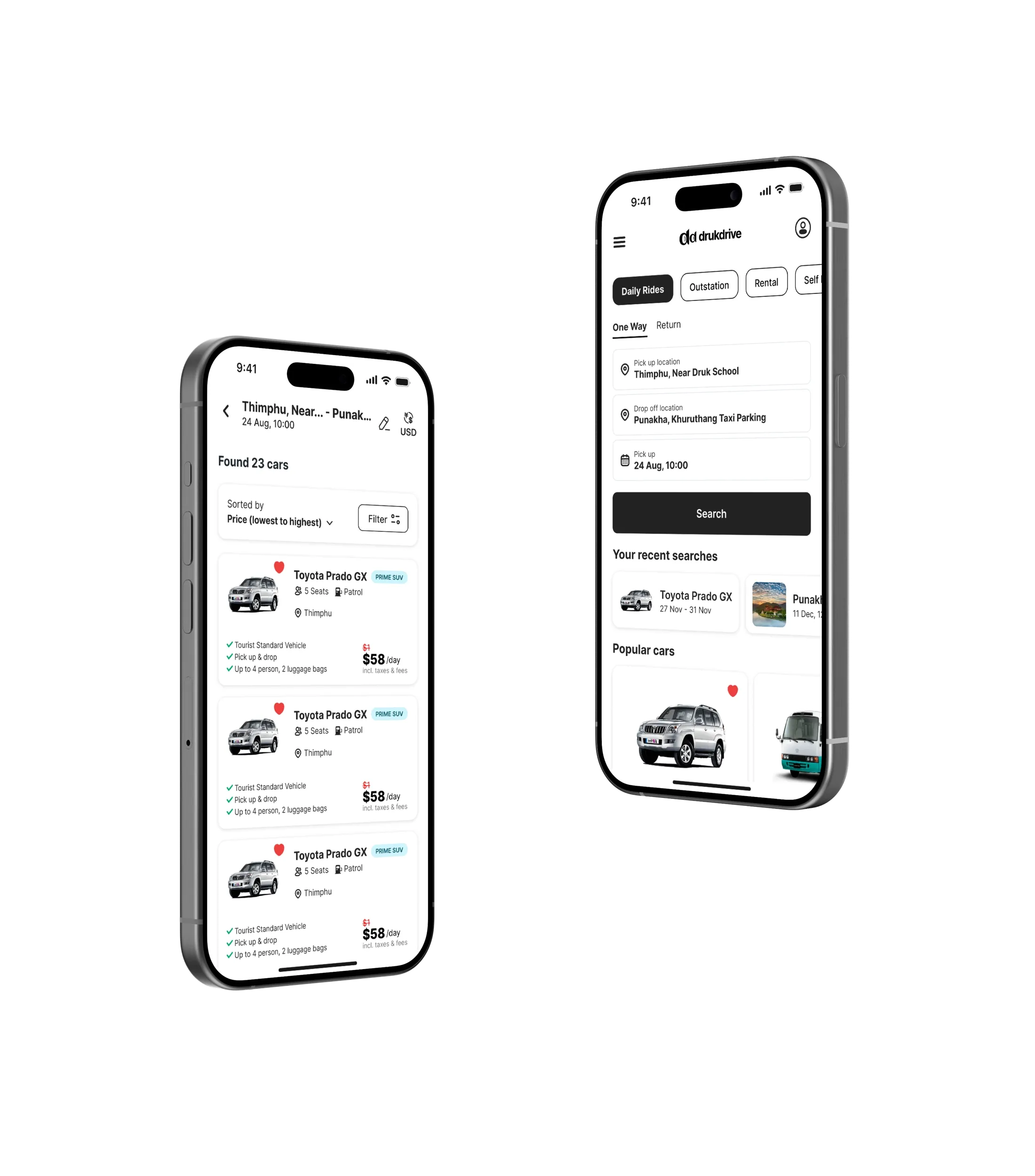
The whole product hangs off one form. Daily Rides, Outstation, Rental and Self Drive are tabs; switching one changes the fields, not the page. Pick up, drop off, date, time, and a duration estimate before you search. The form is the hero on the home page and shrinks to a one-line summary with an edit button on the results page.
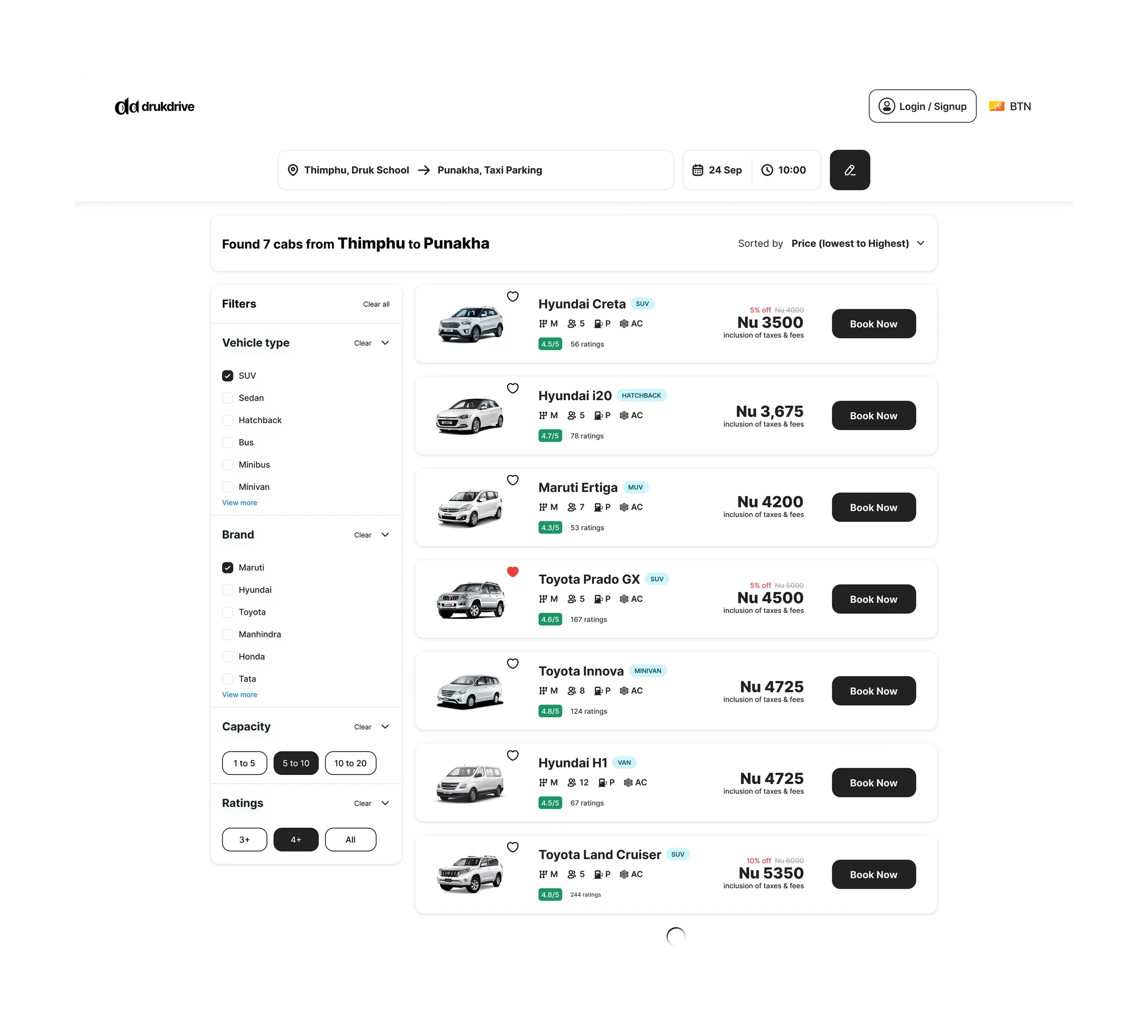
Results are rows, not a grid: photo, name, seats, fuel, AC, a rating badge, the price with taxes included, Book Now. Filters for vehicle type, brand, capacity and rating sit in a column on desktop and behind a Filter button on the phone. Sorting defaults to price, lowest first. You can browse and choose without an account; the app only asks you to sign in when it needs a phone number to send the code to.
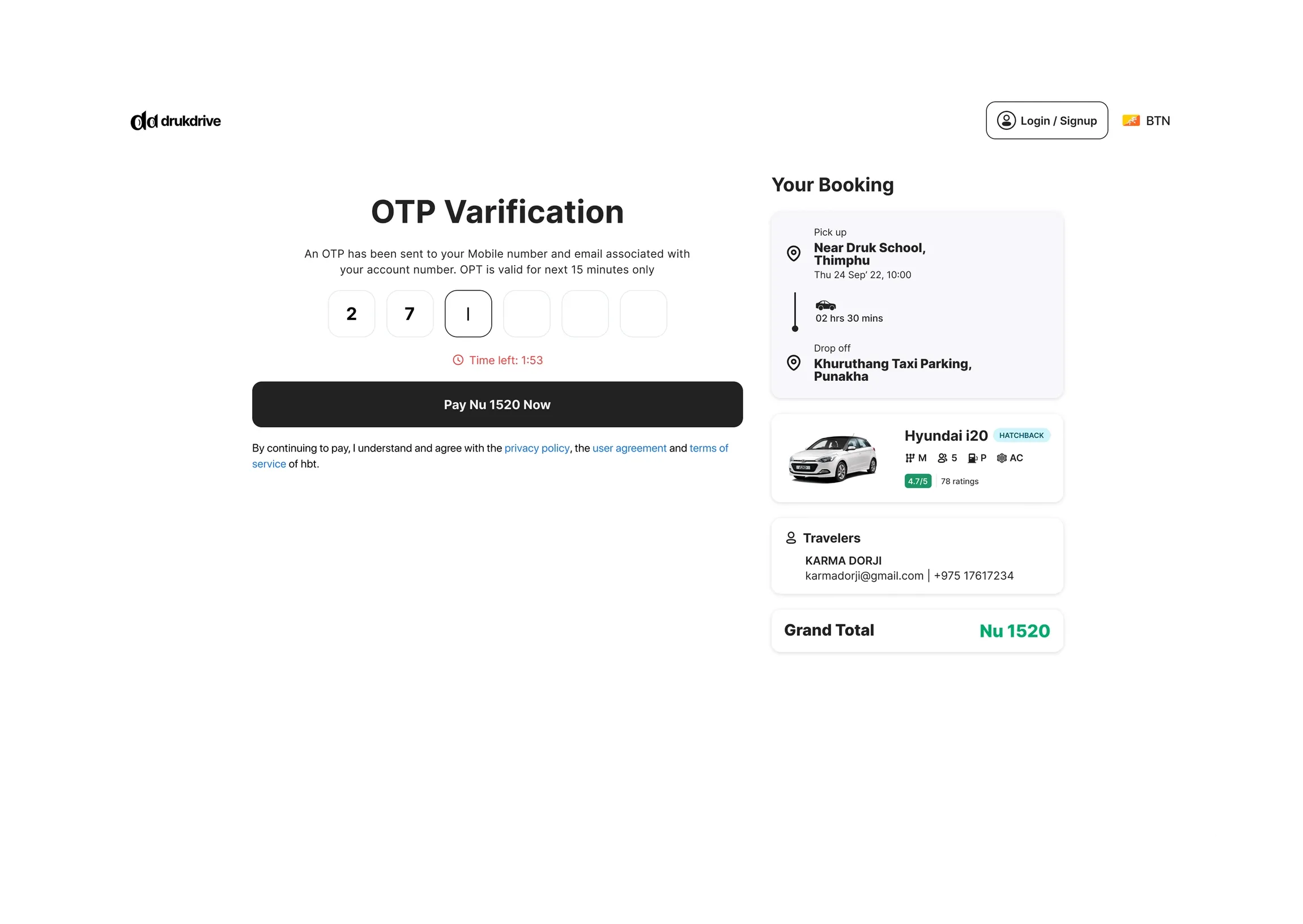
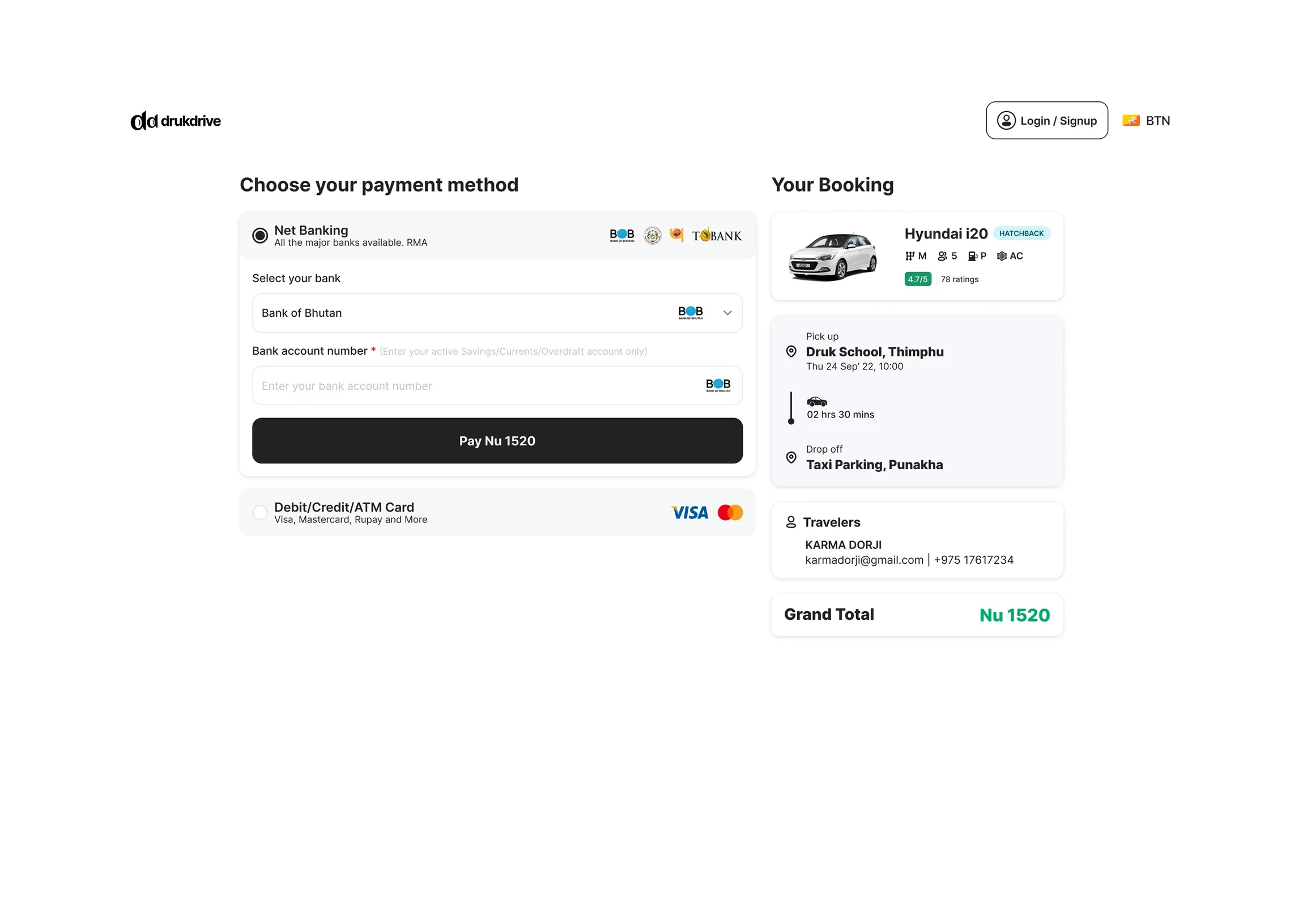
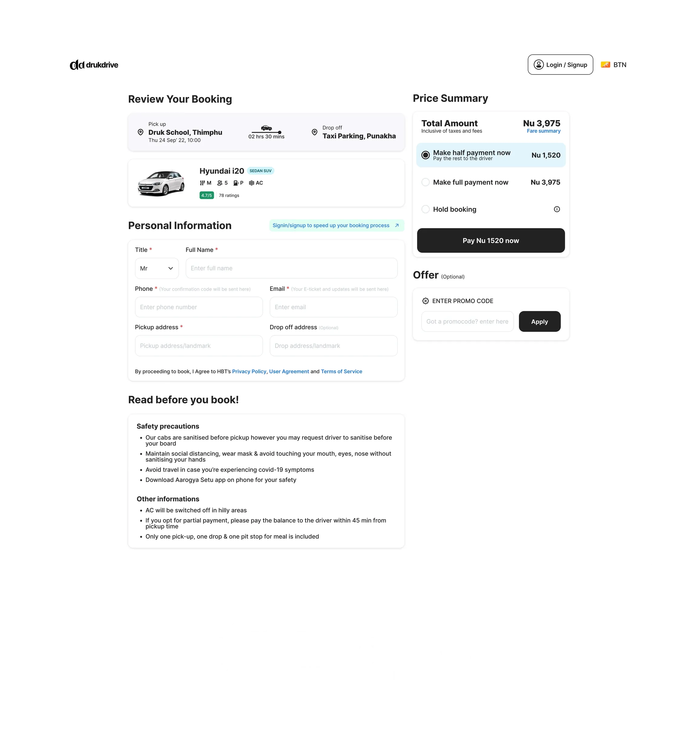
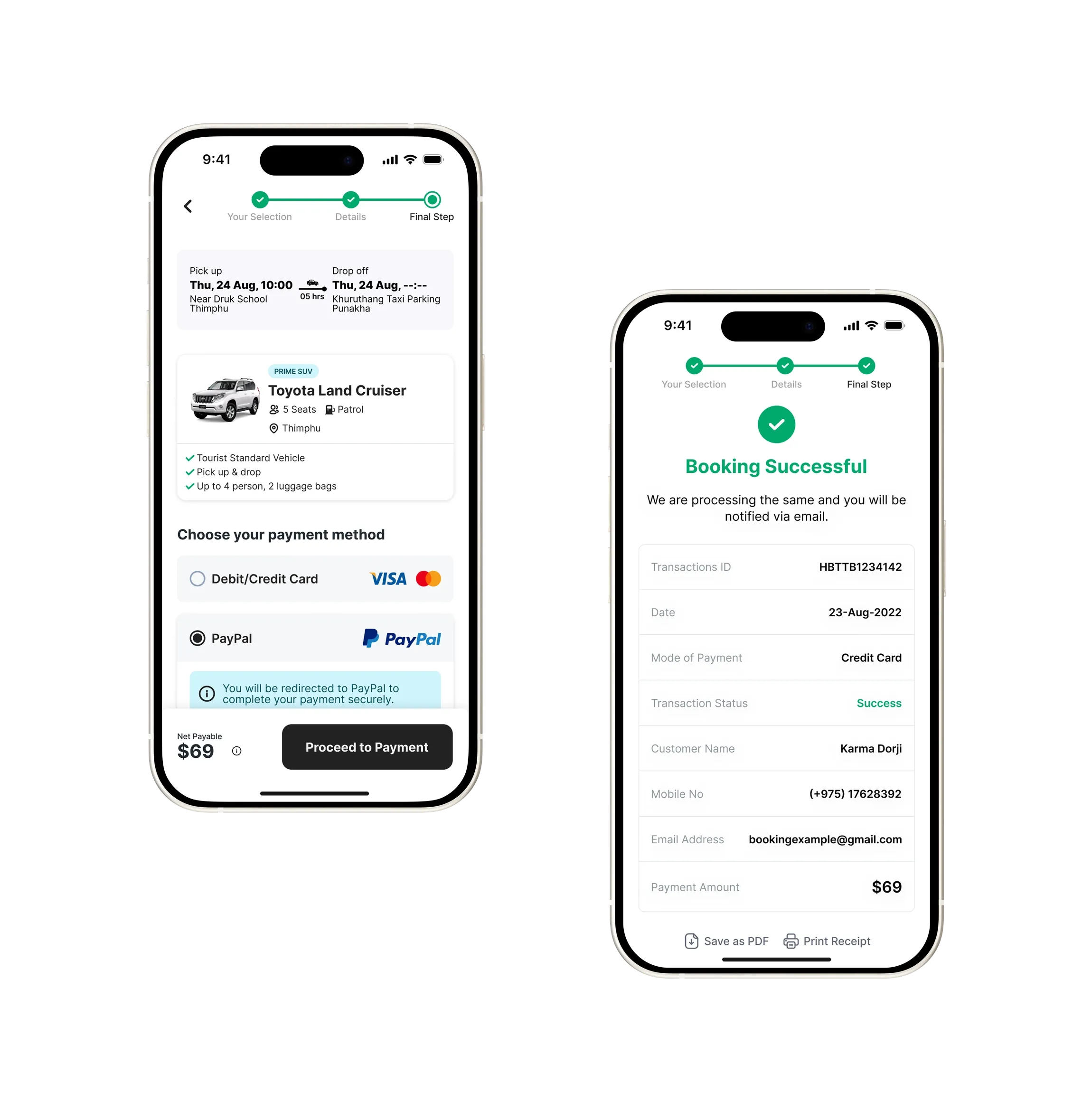
Review, OTP and payment each keep the booking summary on the right: pick up, drop off, the car, the traveller, the total. Paying half now and the rest to the driver is the default, because that is how people already book cabs here. Net banking through the RMA gateway comes first with the Bank of Bhutan and the other local banks; cards and PayPal follow for visitors. The confirmation is a receipt you can save as a PDF, since the driver will ask to see it.
A currency switch in the header shows Nu. for residents and dollars for visitors, on every price, so nobody does mental arithmetic at the roadside.
For the brand we drew a compact “dd” mark that sits beside the wordmark on the web and stands alone in the app tab bar. The palette is ink on cream, with green kept for one job: confirming something worked.
Outcome
Search to a paid, confirmed booking is 4 screens: results, review, code, payment. 56 screens across web, iOS and Android, sharing one set of form fields, rows and buttons. The design handed over includes empty results, a failed payment and a cancelled booking, the states that usually get invented in a hurry later.
What we would do next
A driver-side app: the same booking rows, seen from the other seat. Live trip status once a cab has been dispatched. And rental extras, a child seat or a second driver, priced on the same row as the car instead of in a footnote.