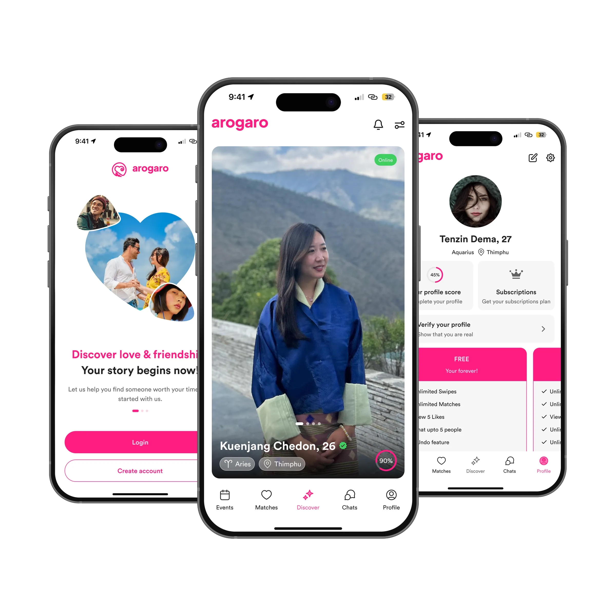
arogaro is Bhutan’s first matchmaking app. In a country of under 800,000 people, that is a different problem from the apps it will be compared to: everyone is two introductions away from everyone else, and a fake profile is a small-town scandal. nine75 designed the app and its brand in 2024: onboarding, Discover, matches, chats, events, a verification flow, subscriptions, and a pink that reads as warm rather than loud.
Problem
The client’s brief was clear about what the app should do and worried about two things. First, trust: people would only join if they believed the other profiles were real, and they would only stay if verification did not feel like a border crossing. Second, tone. Imported dating patterns, swipe, superlike, streaks, read as flippant here. The app had to feel like a friend making an introduction, not a slot machine. And it had to be honest about money: the free tier and the paid tiers needed to say plainly what each one gives you.
Approach
Onboarding is 5 screens: phone number, a code, your name and birthday, 3 photos, and one question about what you are here for. Everything else, star sign, work, hometown, comes later from the profile page, where a score ring shows how complete you are and what one more answer would add.
Discover is one profile at a time, full height. Name, age, a verified tick if earned, a star sign and a town, and a match figure in a ring. Online status is a small green chip. There are no cards behind the card; you look at one person properly, then move on. Matches is a list, Chats is a list, and Events is a list of real gatherings, dinners, hikes, a festival stall, because in Thimphu people would rather meet at something than nowhere.
Verification is 3 steps, a selfie, an ID and a short wait, and the profile page shows it as a single row, Verify your profile, show that you are real, until it is done. Subscriptions are cards laid side by side with the same 5 lines on each, so the difference between Free and paid is read in one glance. The free plan is not hidden.
For the brand we drew a heart mark with an inner curl that reads as two people, set beside a lowercase wordmark. Pink is the accent, used on the one action per screen and on the plan you are looking at; the rest is white and near-black so photographs carry the colour.
Outcome
40 screens for iOS and Android, including the empty states nobody enjoys drawing, no matches yet, no messages, no events this week, each with one sentence and one thing to do. Onboarding dropped from 9 screens to 5. The verification flow was designed with the review queue in mind, so what a member uploads is what a moderator sees.
What we would do next
Safety tools deserve a second pass: block, report and a way to share a date plan with a friend. A referral flow, since introductions are how this country works anyway. And a proper icebreaker on a new match, one question each, because the first message is where most conversations die.